40en Body Piercing & Jewelry・品牌識別系統設計
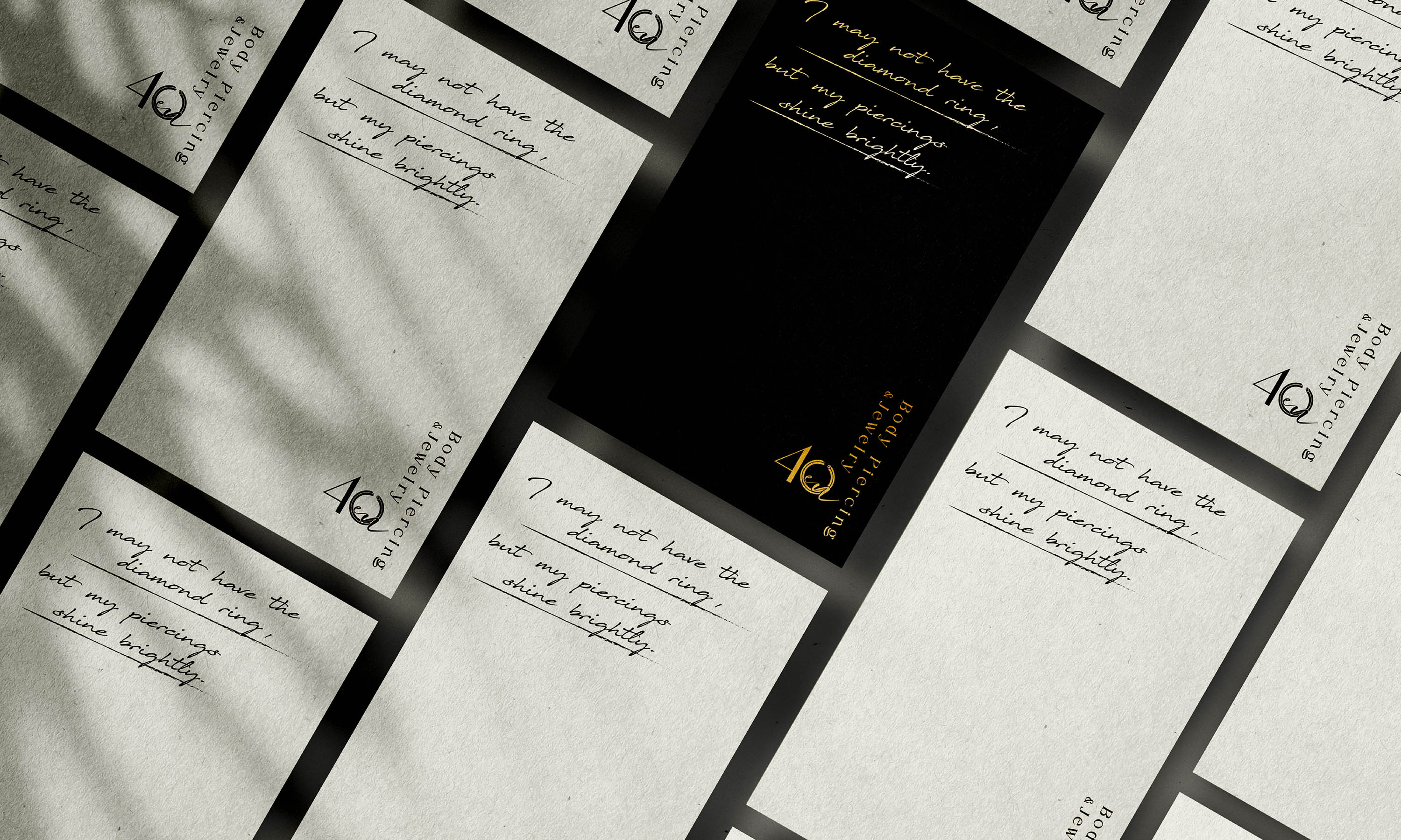
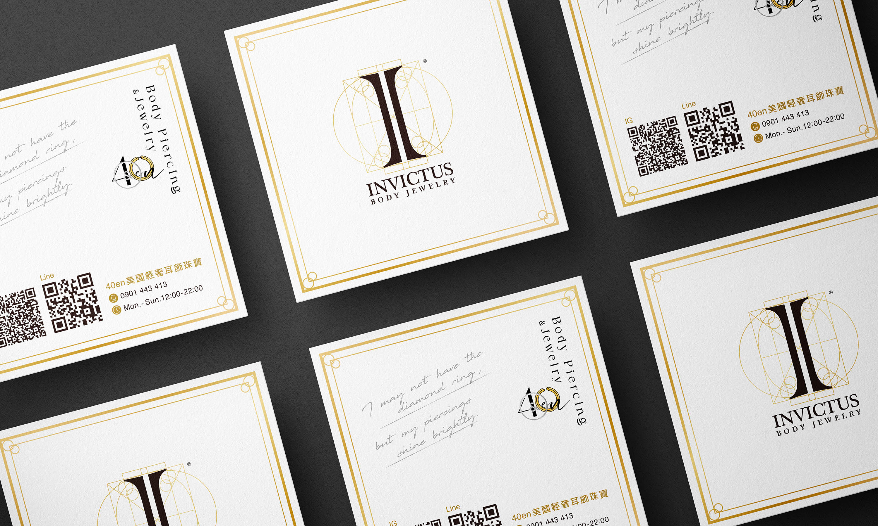
40en為一個輕奢耳飾品牌,原有標誌由創辦人親自設計,承載著品牌初期的理念與情感基礎。本次合作,我們以「品牌再造與識別提升」為核心,保留原始精神,同時重建其視覺系統的一致性與完整度。設計首要目標,在於優化舊商標於實務應用上的限制。原標誌因線條過細、字母與圖樣間距不足,僅能使用於一般平面印刷,無法進行燙金、打凸等加工處理,導致品牌在質感呈現上受到侷限。
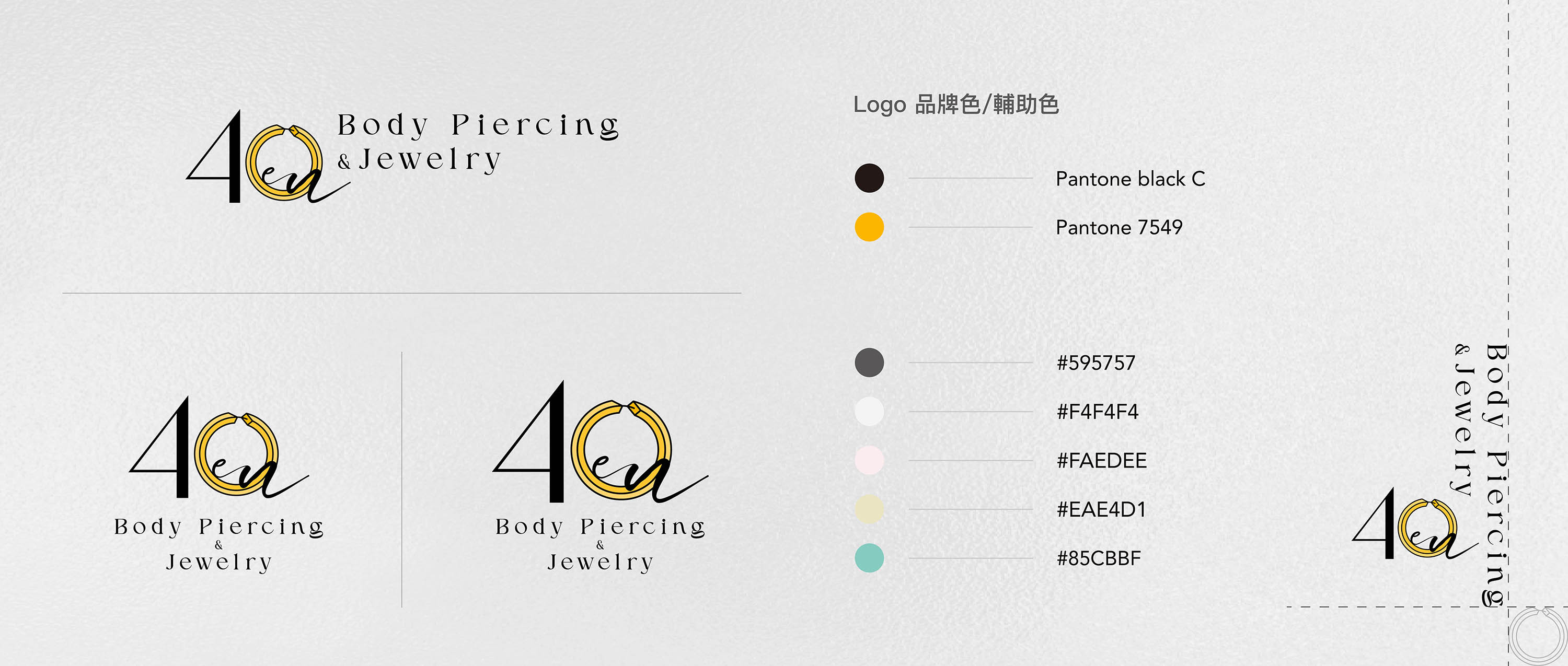
我們保留原有結構比例的前提下,進行細節修正適度加粗線條、重新調整字距與圖文間的留白,使標誌在維持優雅感的同時,具備更佳加工適性與辨識清晰度。修正後標誌可靈活應用於燙金、擊凸等特殊印刷工藝,進一步強化品牌的精緻與高級質感。透過整體風格定位與視覺整合,使品牌在每一次與消費者的接觸中,都能呈現穩定而有記憶點的形象。
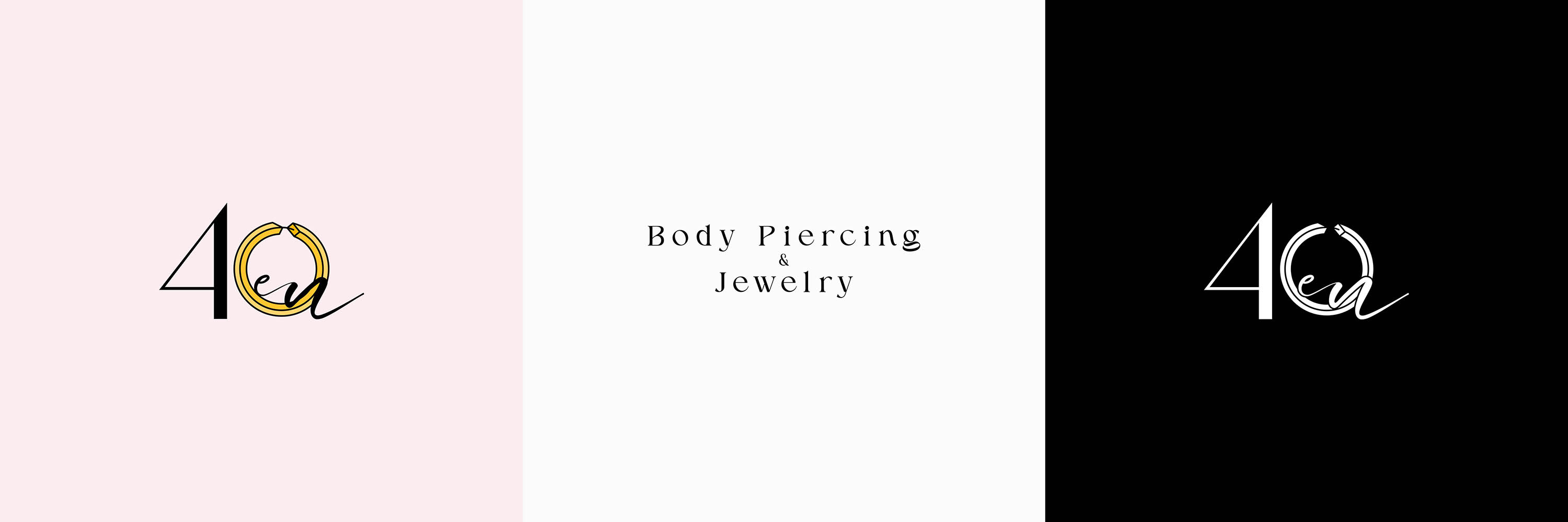
40en is a light-luxury jewelry brand whose original logo was personally designed by the founder, carrying the brand’s early vision and emotional foundation. In this collaboration, our focus was brand refinement and identity enhancement — preserving its original spirit while rebuilding a cohesive and elevated visual system.
The primary objective was to resolve the practical limitations of the existing trademark. Due to overly thin strokes and insufficient spacing between letterforms and graphic elements, the original logo was restricted to standard printing methods and could not accommodate premium finishing techniques such as foil stamping or embossing. This limitation constrained the brand’s ability to express a refined tactile quality.
While maintaining the core proportions of the original structure, we refined critical details —carefully increasing stroke weight and optimizing spacing to enhance clarity and adaptability. The revised mark now supports advanced print applications, including foil stamping and embossing, elevating the overall perception of sophistication and craftsmanship.
Through strategic positioning and visual integration, the brand now communicates with clarity, memorability, and confidence across every touchpoint.This was not merely a logo adjustment it was a strategic refinement that strengthens brand value and reinforces its light-luxury positioning.