


淨森林deepure・企業品牌形象設計
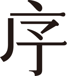
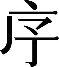
設計發想源自品牌核心理念「森林是地球的肺」,以自然作為語言將「葉子」與「樹枝」等元素轉化為視覺符號,並與品牌名稱產生連結,形塑出如同呼吸般自然流動的品牌意象。在文字設計上,採用細緻輕盈的筆畫結構,透過適度減法與留白,讓視覺更加純淨、清晰,呈現出克制而精準的設計節奏。色彩則以藍綠為主軸,取自森林與天空的交界,綠的生命力與藍的純淨感相互交融,建立出一種清新、安心且富有呼吸感的視覺氛圍。當消費者接觸品牌時,不只是看見產品,而是感受到一種來自自然、無負擔且純淨的生活提案。

The design is inspired by the brand philosophy, “Forests are the lungs of the Earth,” using nature as a visual language to connect elements such as leaves and branches with the brand identity. These organic forms are translated into a fluid and cohesive visual system, evoking a sense of natural rhythm and breath.The typography is crafted with delicate, refined strokes, incorporating thoughtful reduction and negative space to achieve a clean, balanced, and quietly confident presence. This restraint allows the design to communicate with clarity while maintaining a sense of calm sophistication.The color palette is centered around a turquoise tone, drawn from the harmony between forest and sky where the vitality of green meets the purity of blue. This combination creates a fresh, soothing, and breathable visual atmosphere, offering consumers not just a product, but an experience of natural, non-toxic comfort.


