



nooka・食品包裝設計
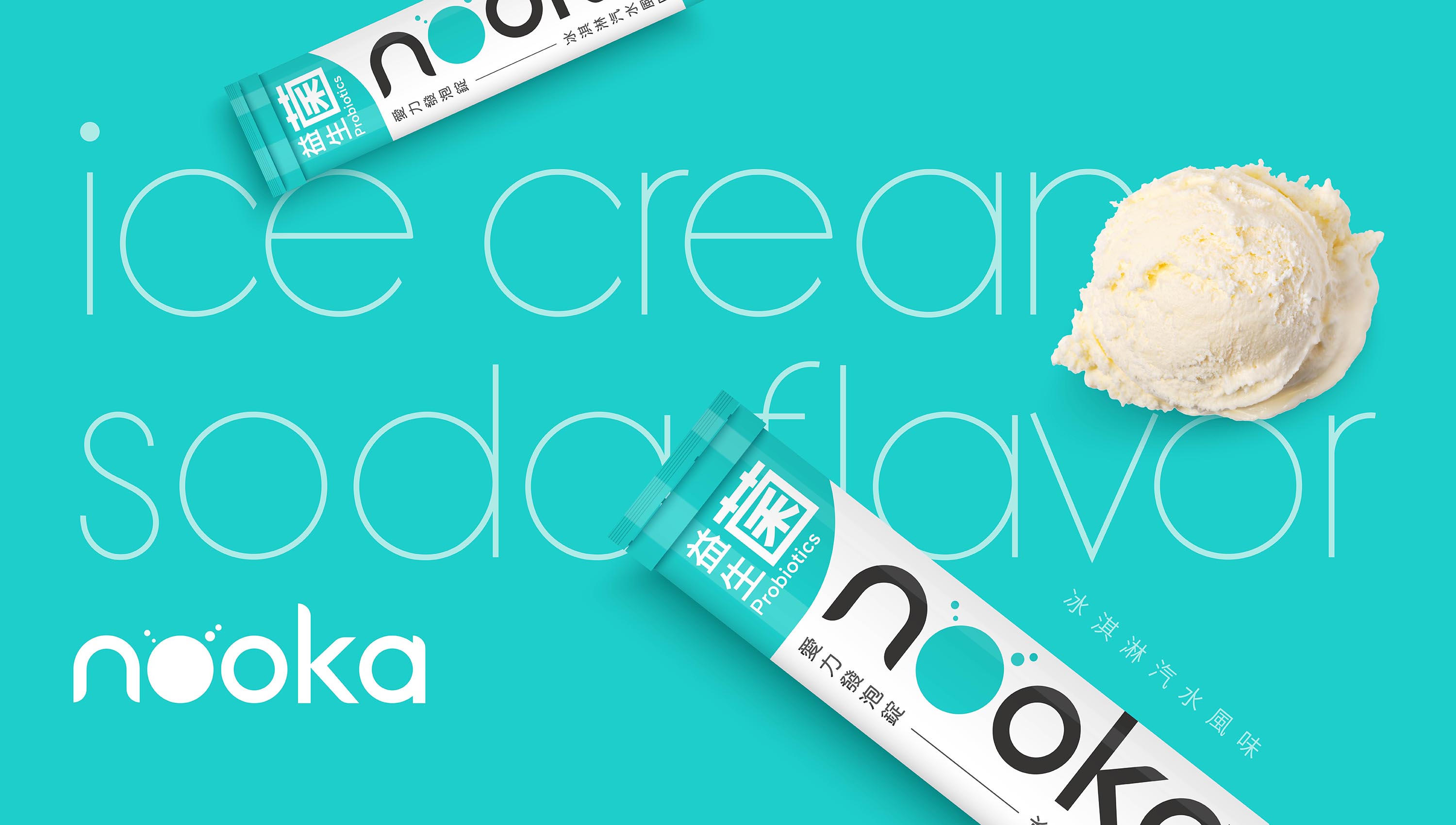
老牌愛力食品公司,多年來以經典的「愛力維他命C」深植人心。為了回應新世代市場的轉變,品牌突破既有印象,跳脫市面上常見的果汁風味發泡錠,創新推出大人小孩皆喜愛的「冰淇淋汽水風味」,為產品注入更具記憶點的感官體驗。
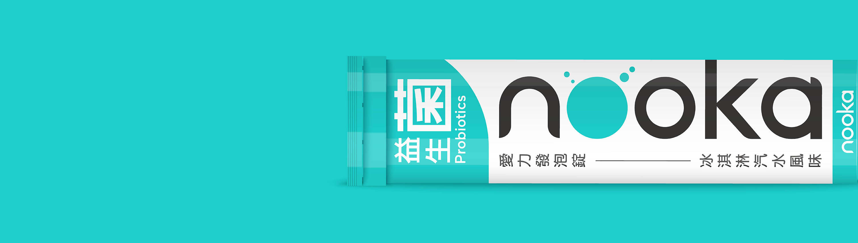
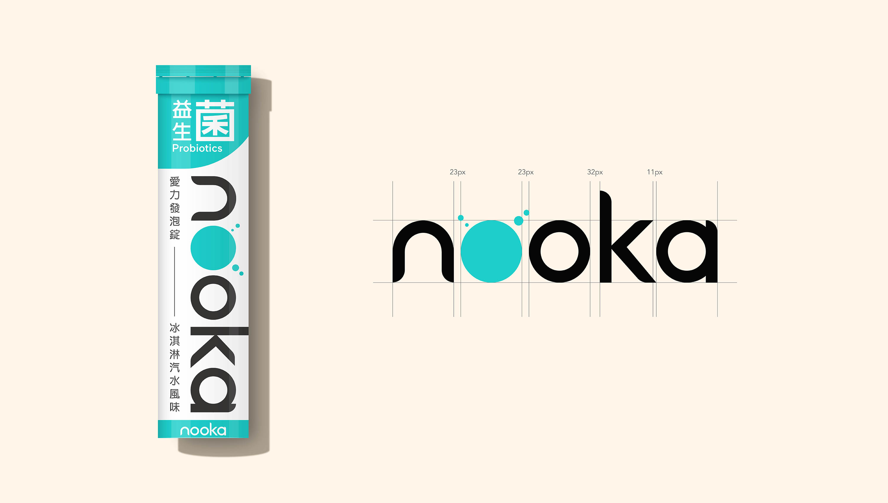
在設計上,強化新子品牌的辨識與熟悉度,將品牌Logo作為視覺核心,使消費者在第一眼即建立連結。整體風格以專業與清爽為基調,透過簡潔有力的視覺語言,傳遞產品的純淨與信賴感。字體設計採用粗體黑體作為結構基礎,並於部分筆畫中加入圓角處理,讓整體在穩重之中保有親和與輕盈,避免過於僵硬。色彩則選用清爽的藍綠色系,呼應冰淇淋汽水的清新印象,營造出沁涼、愉悅且具辨識度的品牌氛圍。
Aili Foods, a well established brand known for its iconic Vitamin C products, has long held a strong presence in the market. To adapt to evolving consumer preferences and enhance competitiveness in a new era, the brand moves beyond the conventional fruit-flavored effervescent tablets and introduces an innovative “Ice Cream Soda” flavor designed to appeal to both adults and children while creating a more memorable sensory experience.
To strengthen recognition of this newly developed sub brand, the logo is positioned as the primary visual focus, ensuring immediate brand recall at first glance. The overall design direction emphasizes professionalism and freshness, using a clean and refined visual language to convey purity and trust.
The typography is built on a bold sans-serif foundation, with subtle rounded details applied to selected strokes. This approach balances structure with approachability, softening the rigidity typically associated with bold type. The color palette centers around refreshing turquoise tones, inspired by the cool and uplifting sensation of ice cream soda, creating a vibrant yet clean brand identity.