PETITES GOURMANDS・甜點品牌設計
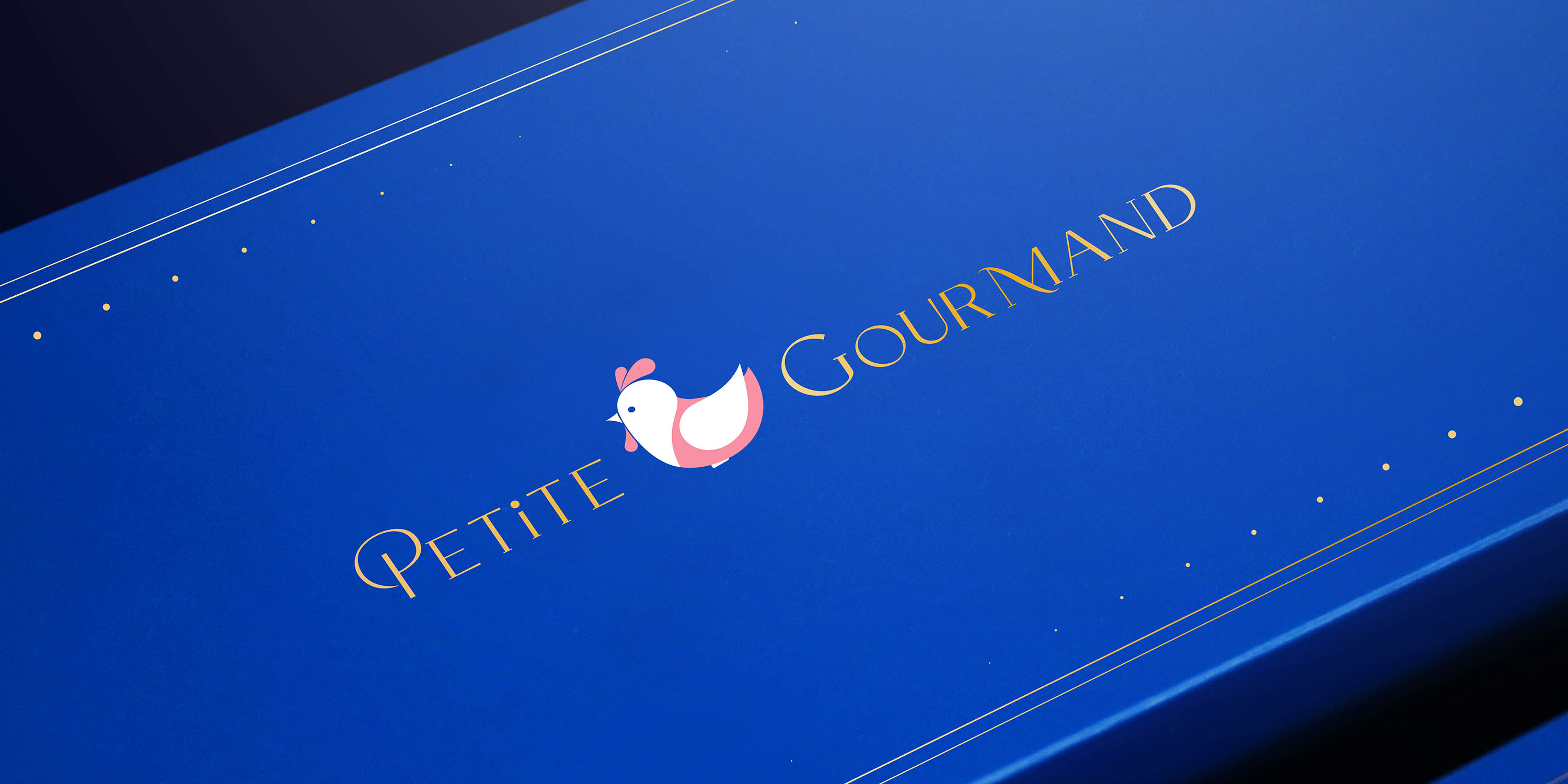
公雞,是法國巴黎的象徵,也是一種精神的化身。它代表著創辦人留學法國的記憶與養分,更象徵一份對專業、細節與儀式感的堅持。品牌以「法式甜點精神」為核心,將精緻工藝與兒童育幼理念結合,在甜美與溫柔之間找到平衡。我們相信,甜點不只是味覺的享受,更是一種陪伴與愛的表達。
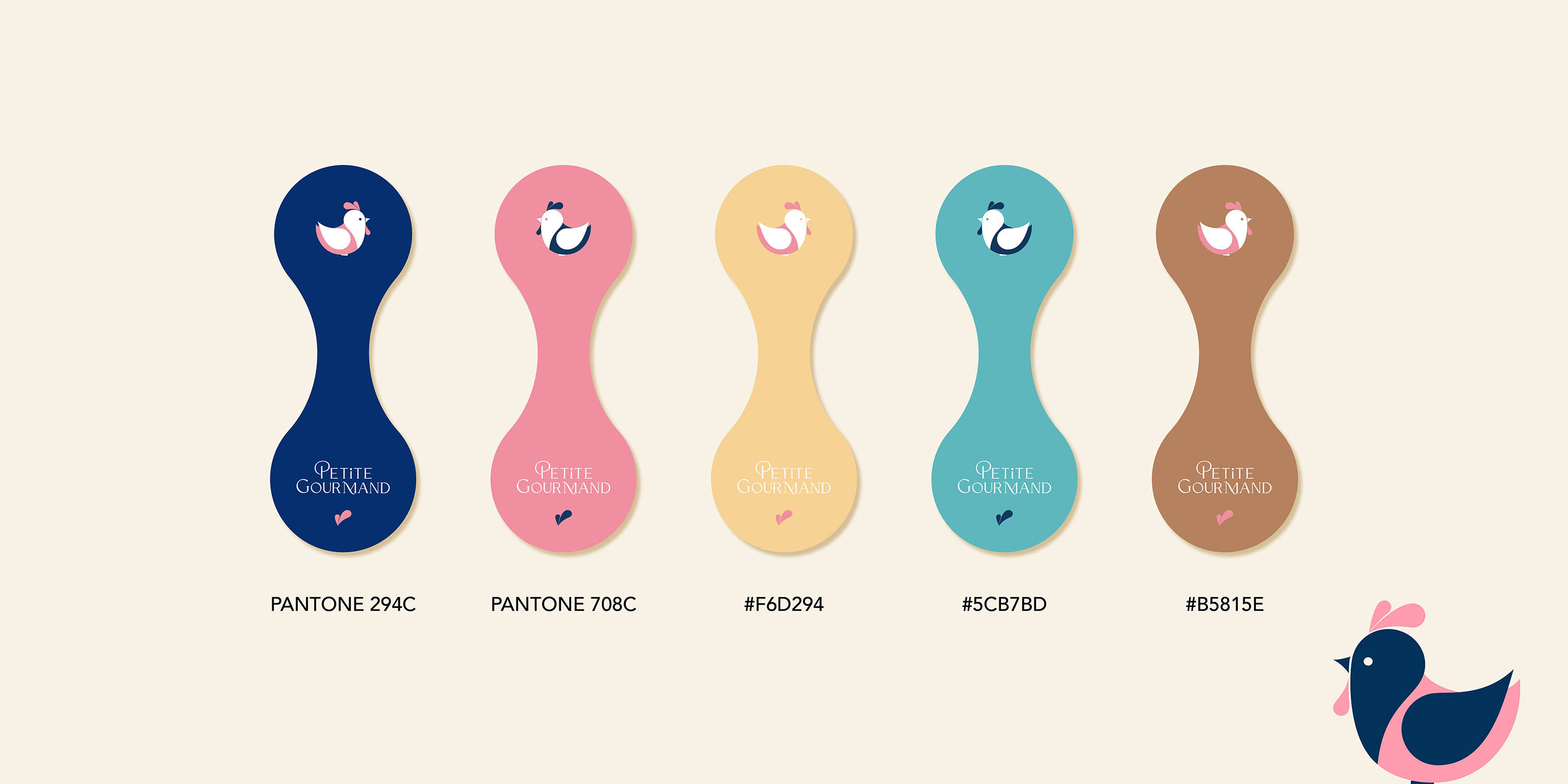
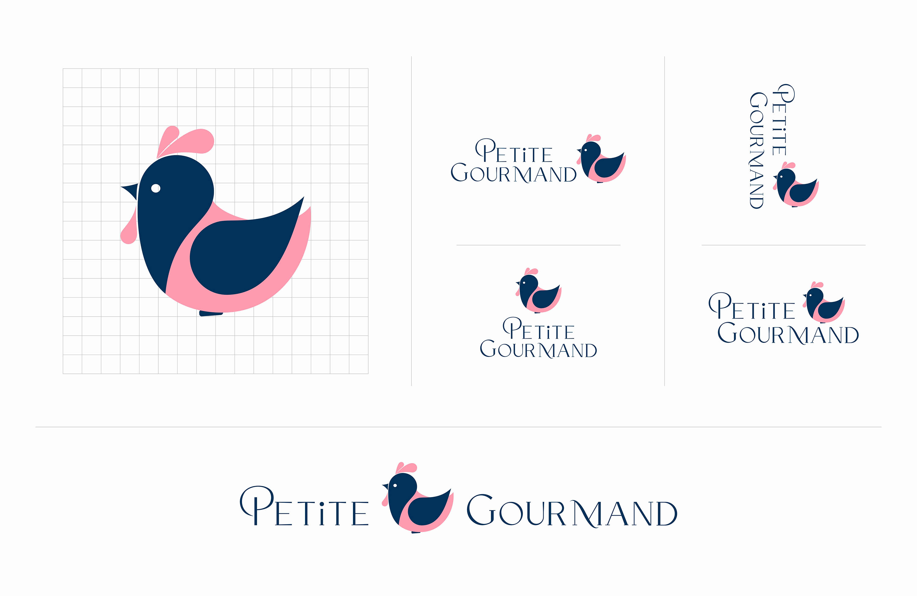
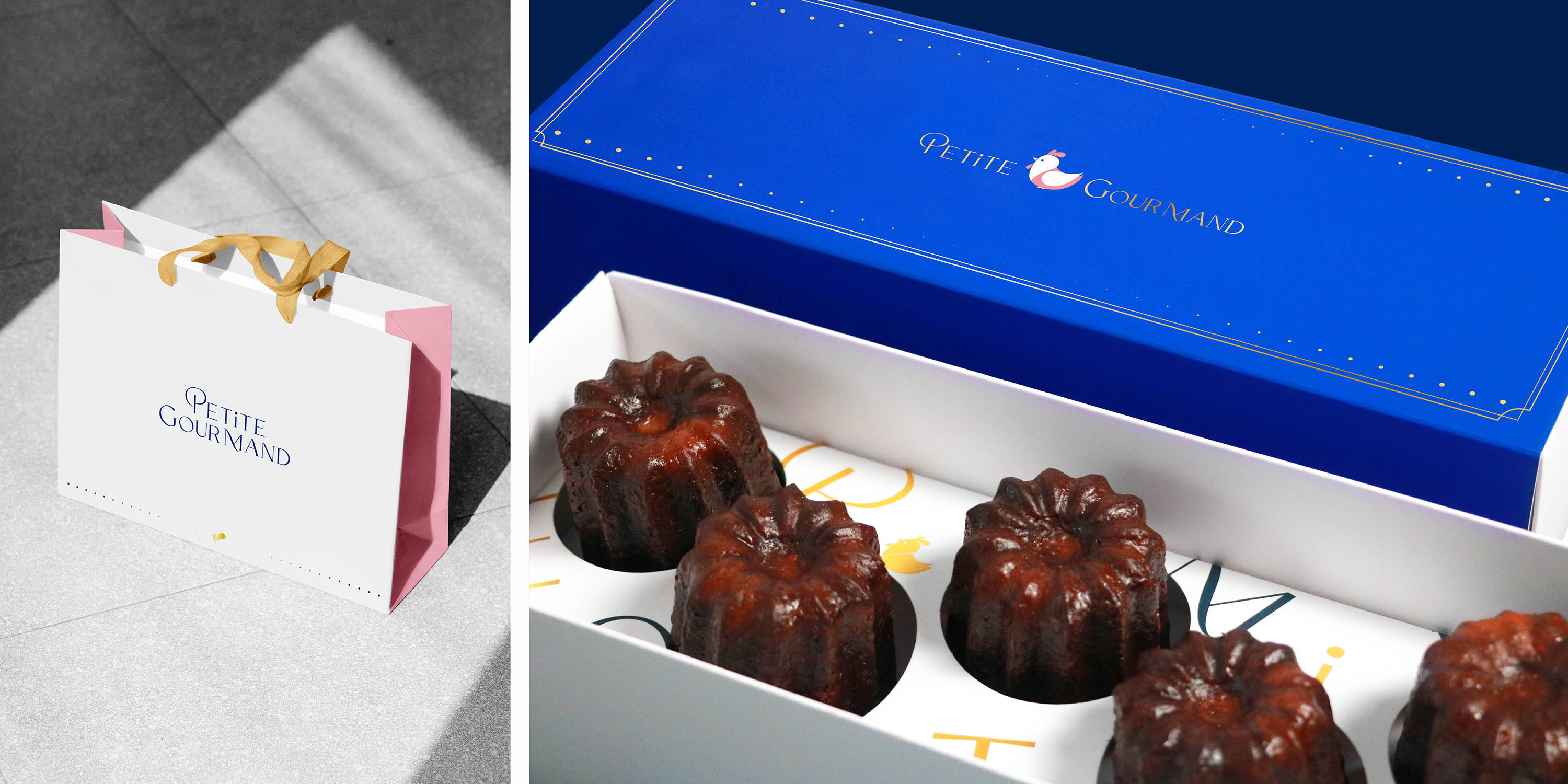
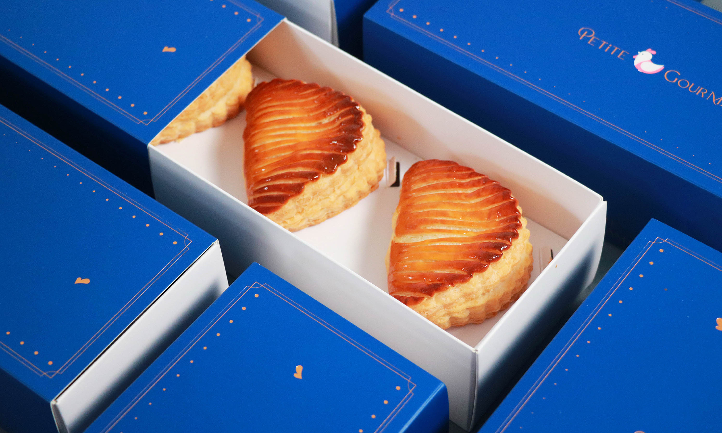
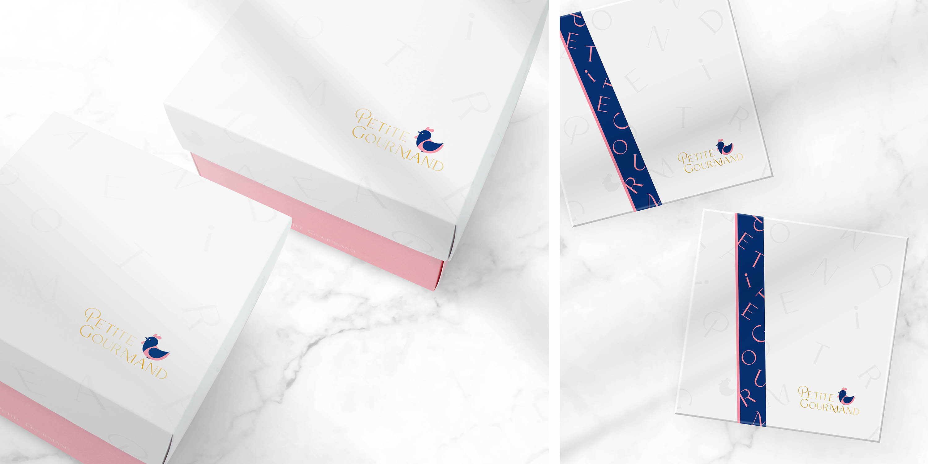
標誌以公雞為主要視覺圖樣,透過圓潤線條與細節比例的拿捏增添童趣與親和力,讓孩童感到喜愛與安心。同時搭配襯線字體,保留法式優雅與精緻質感,使整體在童真之中依然流露出成熟而穩定的品牌氣質。在色彩上,選用法國國旗紅、白、藍作為基礎配色,低調而富有層次地傳達法式氣息,讓品牌在視覺上既溫暖又具有識別度。
我們希望每一位年輕媽媽,即使成為母親,也不要忘記年輕時的那份儀式感與對生活的期待。在孩子成長的每一個日常裡,也能保有屬於自己的優雅與美好。這不只是甜點品牌,而是一份法式生活態度的延續。
The rooster, a symbol of Paris and of France itself, embodies both heritage and spirit.It reflects the founder’s formative years studying in France, and represents a devotion to craftsmanship, detail, and the art of ritual.
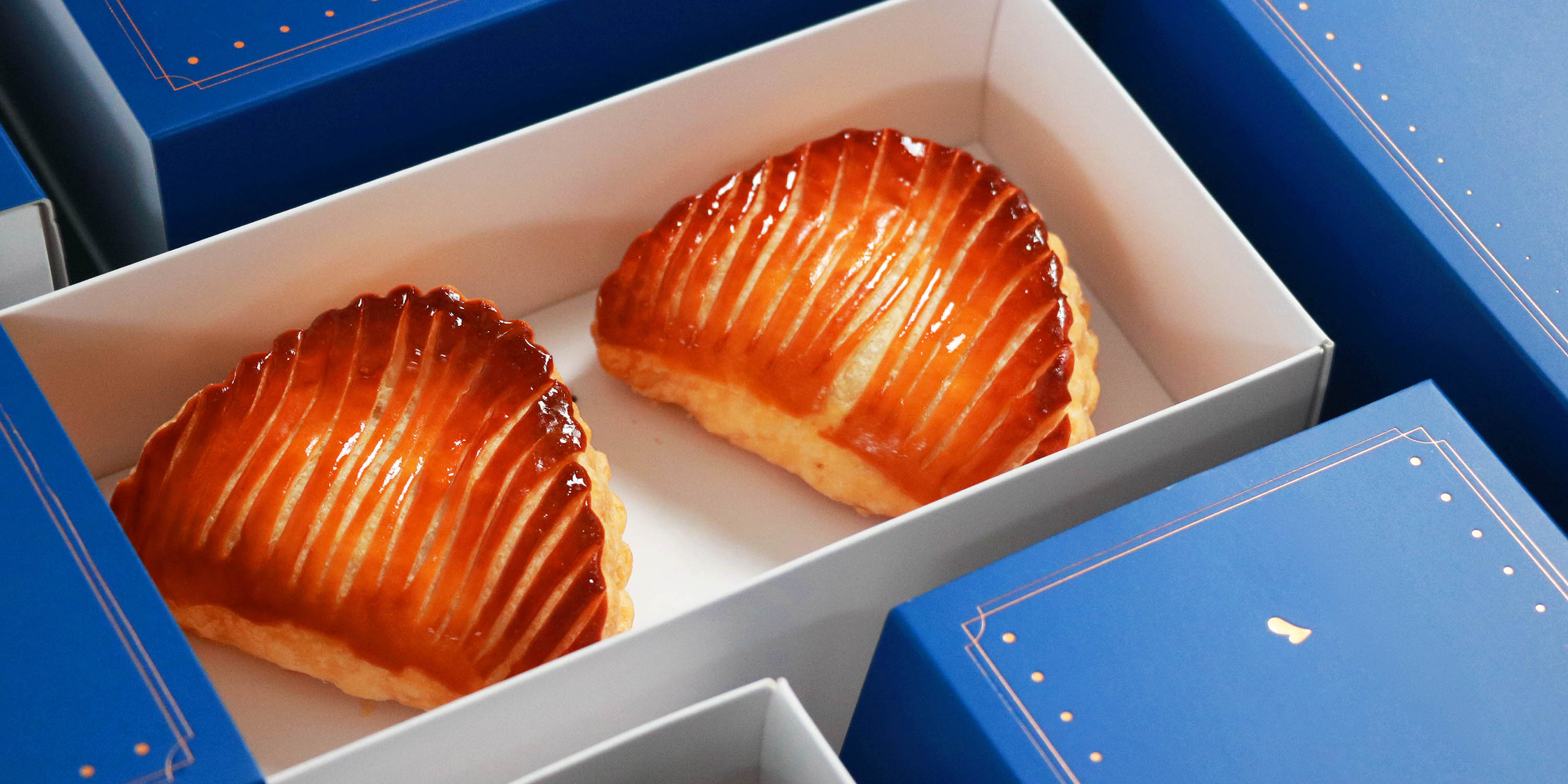
Rooted in the professional spirit of French pâtisserie, the brand brings together refined dessert craftsmanship and early childhood care. We believe that desserts are more than indulgence they are expressions of love, comfort, and shared moments.
The logo centers around the rooster as its primary visual element. Through softened curves and carefully balanced proportions, the mark introduces a sense of playfulness that appeals to children, while maintaining elegance through the use of serif typography. This combination allows the identity to feel both whimsical and sophisticated.The color palette draws inspiration from the French tricolor red, white, and blue subtly interpreted to convey a refined Parisian atmosphere while preserving warmth and approachability.
We hope that every young mother, even after stepping into motherhood, will not forget the sense of ritual and beauty she once cherished in her youth. Amid the daily rhythm of raising a child, there remains space for elegance, sweetness, and self-expression.This is not merely a dessert brand it is an extension of a French way of living.