


She Design Works・品牌設計與網站規劃
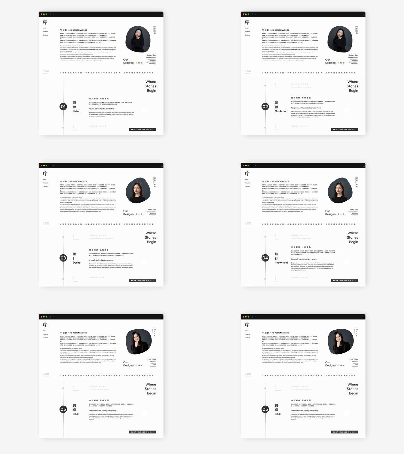
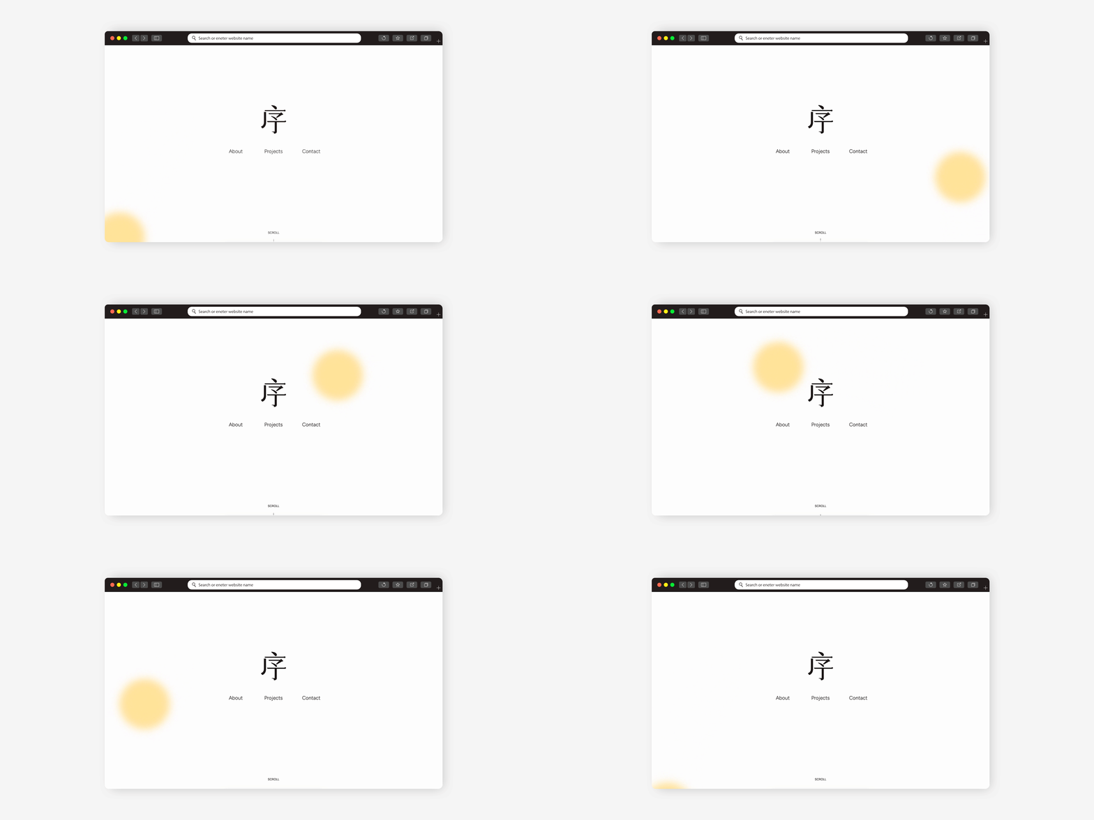
我們相信,品牌宛如一本書的序。從理念到設計品牌在日常的每一個細節中被看見並感受。書的「序」看似低調,卻承載了整個故事的精神,這就是我們命名的由來。序設計成為品牌的開端,替它寫下專屬的序章。我們選用黑與白作為基調。白色象徵包容與創造。黑色提醒我們,即使是不完美,也能被設計轉化,化為獨特的價值。
我們專注於品牌整合與包裝結構設計,服務涵蓋品牌識別、包裝、網站介面與空間形象。對我們而言,設計不僅是解決問題,更要是創造價值,讓作品兼具實效與美感,為品牌開啟屬於它的「序」章。
We believe a brand is like the preface of a book.
From concept to execution, it is seen and felt through the details of everyday experiences. While often understated, a preface holds the essence of the entire story.
This belief is the origin of our name, She Design Works a studio that exists to shape the beginning of every brand, crafting its unique opening chapter.
Black and white form the foundation of our visual philosophy.
White represents openness and creation, while black reminds us that even imperfections can be transformed through design into distinctive value.
We specialize in brand integration and packaging structure design, offering services that span brand identity, packaging, web interfaces, and spatial branding.
To us, design is not only about solving problems, but about creating value — balancing impact with aesthetics, and opening a meaningful preface for every brand we work with.